Best Buy kept the main characteristics of their original logo
For all of Best Buy’s customers, the change in the company logo was a significant rebranding. This is a large corporation that people have known for a long time. The company began as a retailer of sound systems and electronic goods and had its first logo designed in 1966.
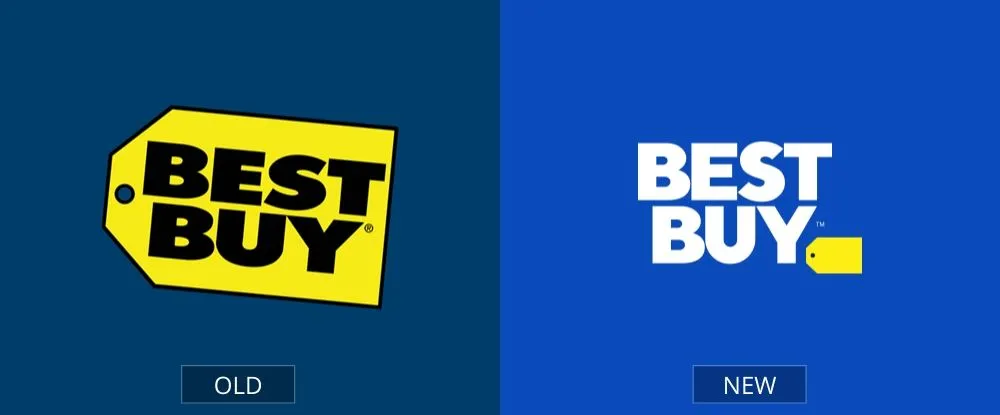
The yellow tag was revamped in 2018. Although the yellow tag remained on the emblem, it shrank and was relegated to the bottom right corner, separated from the writing. Everybody recognizes this logo as the same large, yellow price tag, which is why the makeover worked so well for this company.
Pages: Page 1, Page 2, Page 3, Page 4, Page 5, Page 6, Page 7, Page 8, Page 9, Page 10, Page 11, Page 12, Page 13, Page 14, Page 15, Page 16, Page 17, Page 18, Page 19, Page 20, Page 21, Page 22, Page 23, Page 24, Page 25, Page 26, Page 27, Page 28, Page 29, Page 30, Page 31, Page 32, Page 33, Page 34, Page 35, Page 36, Page 37, Page 38, Page 39, Page 40