Check out the logo of the International House of Pancakes
The IHOP logo, as simple as it is, is the result of a long journey from a nice picture to a simplistic yet meaningful logo. From elaborate, colorful emblems to the simplistic and welcoming symbol everybody knows today, the American restaurant chain’s visual identity has come a long way.
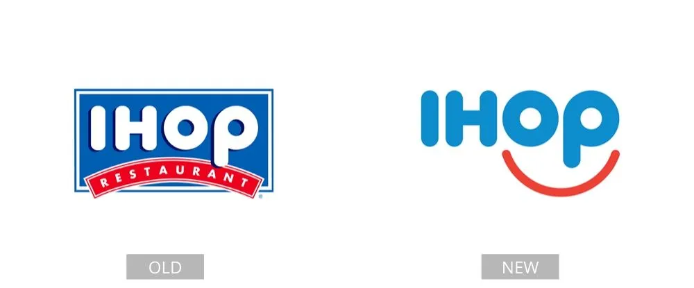
Throughout the years, five distinct versions of the famous brand’s symbol have been created, and the current one is radically different from those first launched. In 2015, IHOP unveiled a brand new and innovative logo design. Their most recent design preserves the existing typeface but adds a red line that forms a happy face.
Pages: Page 1, Page 2, Page 3, Page 4, Page 5, Page 6, Page 7, Page 8, Page 9, Page 10, Page 11, Page 12, Page 13, Page 14, Page 15, Page 16, Page 17, Page 18, Page 19, Page 20, Page 21, Page 22, Page 23, Page 24, Page 25, Page 26, Page 27, Page 28, Page 29, Page 30, Page 31, Page 32, Page 33, Page 34, Page 35, Page 36, Page 37, Page 38, Page 39, Page 40