The logo of one of the most well-known magazines in the world
RollingStone is a popular culture magazine published monthly in the United States. Since their debut issue, they have been supplying fans with amazing interviews and interesting news, and they are still as impressive as ever. However, the logo has required an update for quite some time.
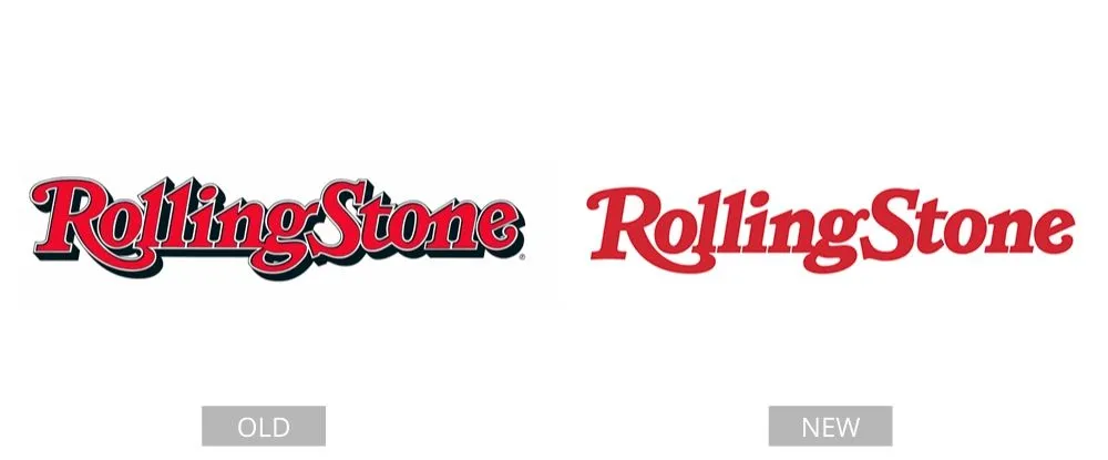
The corporation worked with the man who designed its first logo. The outlines were eliminated to make them simpler and easier to look at. However, the typeface was kept the same and the main color was preserved. The makeover of the magazine title’s visual identity did not affect the logo’s distinctive style. Still, this facelift did simplify and clean up the logo’s shapes.
Pages: Page 1, Page 2, Page 3, Page 4, Page 5, Page 6, Page 7, Page 8, Page 9, Page 10, Page 11, Page 12, Page 13, Page 14, Page 15, Page 16, Page 17, Page 18, Page 19, Page 20, Page 21, Page 22, Page 23, Page 24, Page 25, Page 26, Page 27, Page 28, Page 29, Page 30, Page 31, Page 32, Page 33, Page 34, Page 35, Page 36, Page 37, Page 38, Page 39, Page 40