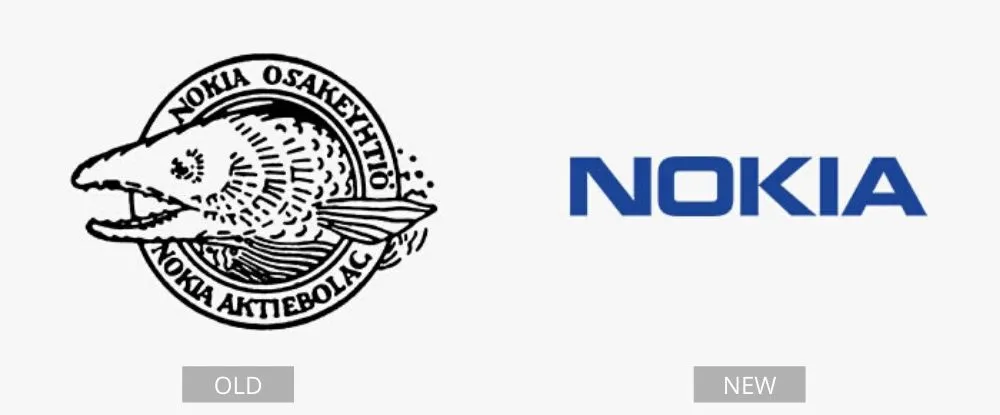
They gave Nokia several facelifts
The Nokia company’s first logo was extremely unappealing. It was created when the company was a major industrial powerhouse in Finland and needed to be updated to keep up with the times. This first logo showed a fish that was supposed to be a salmon from the Nokianvirta River.

The logo was used for over a century without any significant changes. Nokia Osakeyhtiö’s logo was updated for the first time in 1965. Since 1967, Nokia has experimented with several shades of blue. But all of the previous shades are lighter than the current one. They went through a number of revisions before settling on the current logo that everybody recognizes today.
Pages: Page 1, Page 2, Page 3, Page 4, Page 5, Page 6, Page 7, Page 8, Page 9, Page 10, Page 11, Page 12, Page 13, Page 14, Page 15, Page 16, Page 17, Page 18, Page 19, Page 20, Page 21, Page 22, Page 23, Page 24, Page 25, Page 26, Page 27, Page 28, Page 29, Page 30, Page 31, Page 32, Page 33, Page 34, Page 35, Page 36, Page 37, Page 38, Page 39, Page 40


