Logos can be found everywhere. They are in the clothes we wear, the phones we use, and the food we eat. There’s no denying that a good logo can clearly communicate to the audience what the company is about and why consumers should care about it. Having a memorable and easy-to-recognize logo can enhance brand loyalty and awareness. Some companies have gone through numerous logo alterations before settling on their own brand identity. Rebranding is a journey a company can go through to convey a new message. Kurt Weidemann, a famous graphic designer, said, “a good logo can be scratched in the sand with your big toe.” Here, we present a variety of logos. The good ones should be easy to immediately recognize and identify.

IBM’s logo conveys the speed of the company’s expansion
IBM (International Business Machines) is one of those companies that has a long history. This multinational technology corporation based in the United States manufactures and distributes software, computer hardware, infrastructure, and consulting services. It is one of the world’s largest information technology firms. Take a look at how its logo has changed throughout the years.
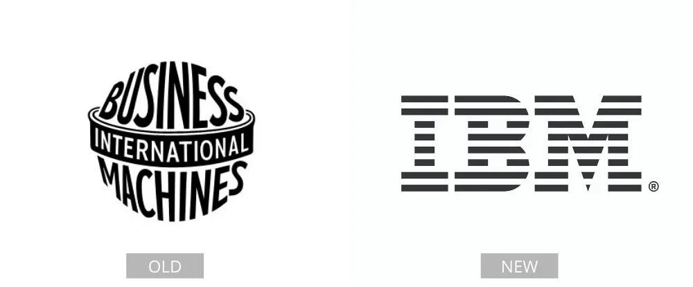
IBM featured a circular logo that looked like a globe and was made up of the company’s name. Now, IBM’s logo is recognized worldwide. The white stripes that go through the letterforms provide the illusion of equal signs in the lower parts of the letters. This symbolizes equality. Honestly, it changed for the better.