This is the new design of The Guardian newspaper’s logo
The Guardian is one of the top news organizations in the world. The British daily newspaper’s current period began in 1959 when its original name, The Manchester Guardian, was simplified to The Guardian. They determined that their colored logo needed to be changed so that their users would focus more on the content. They introduced a new design written entirely in black, making it simpler to read and understand.
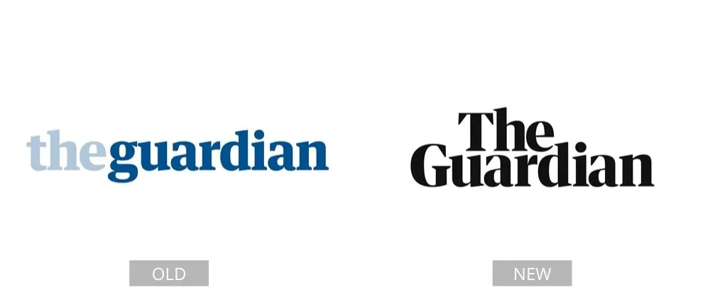
Their font remained the same, but the layout changed slightly. The new version looks simpler and more modern. The Guardian has no shareholders and is not owned by a billionaire. It is driven by the desire to create high-impact global reporting that is never influenced by commercial or political interests.
Pages: Page 1, Page 2, Page 3, Page 4, Page 5, Page 6, Page 7, Page 8, Page 9, Page 10, Page 11, Page 12, Page 13, Page 14, Page 15, Page 16, Page 17, Page 18, Page 19, Page 20, Page 21, Page 22, Page 23, Page 24, Page 25, Page 26, Page 27, Page 28, Page 29, Page 30, Page 31, Page 32, Page 33, Page 34, Page 35, Page 36, Page 37, Page 38, Page 39, Page 40

