Uber’s new logo is definitely the best so far
As we all know, Uber is a rather new business. This rideshare app has swiftly gained popularity, and people in many countries have begun to rely only on Uber for transportation. In 2010, when the company was still known as UberCab, it debuted a logo that featured a red “UC” with its name above it.
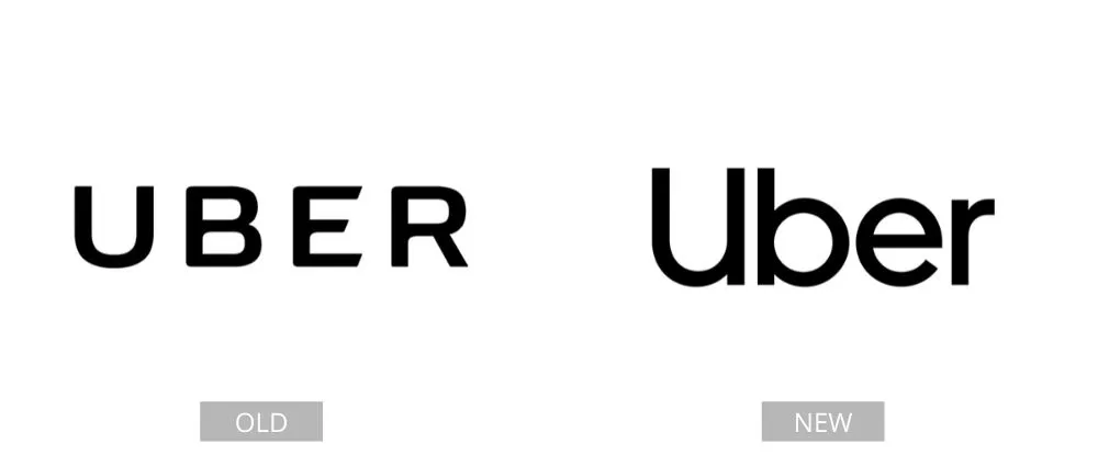
When the company’s name was changed to Uber, the “C” and the word “Cab” were removed from the logo. The new emblem is similar, except instead of capital letters, they chose lowercase letters now. It looks simple and professional, which are words they want the brand to be associated with.
Pages: Page 1, Page 2, Page 3, Page 4, Page 5, Page 6, Page 7, Page 8, Page 9, Page 10, Page 11, Page 12, Page 13, Page 14, Page 15, Page 16, Page 17, Page 18, Page 19, Page 20, Page 21, Page 22, Page 23, Page 24, Page 25, Page 26, Page 27, Page 28, Page 29, Page 30, Page 31, Page 32, Page 33, Page 34, Page 35, Page 36, Page 37, Page 38, Page 39, Page 40