The coffee cup of history holds the evolution of the Starbucks logo
Before arriving at its current, minimalist appearance, the Starbucks logo underwent several variations. The original logo from 1970 was brown and had the words “Coffee, Tea, Spices.” Starbucks removed many of the classic design components from its logo after realizing how strong and popular its brand had become.
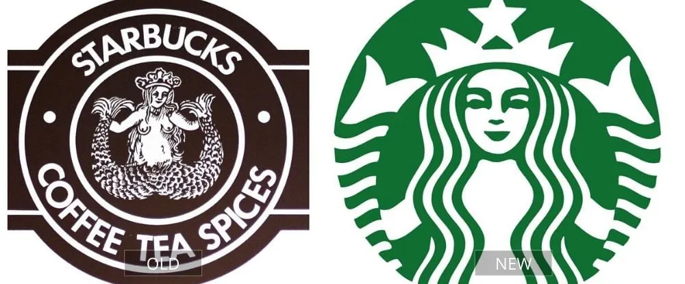
While the original logo was also minimalist, the new one is considerably simpler. The green is far better than the original color and has been changed into something eye-catching and easy to distinguish. According to Starbucks, this new logo allows the brand to appeal to and connect with audiences all around the world.
Pages: Page 1, Page 2, Page 3, Page 4, Page 5, Page 6, Page 7, Page 8, Page 9, Page 10, Page 11, Page 12, Page 13, Page 14, Page 15, Page 16, Page 17, Page 18, Page 19, Page 20, Page 21, Page 22, Page 23, Page 24, Page 25, Page 26, Page 27, Page 28, Page 29, Page 30, Page 31, Page 32, Page 33, Page 34, Page 35, Page 36, Page 37, Page 38, Page 39, Page 40