The story behind Dunkin’ Donuts’ logo
Dunkin’ Donuts, a multinational coffee and donut company based in the United States, debuted its original logo design in 1950. This was a crimson wordmark in a cursive script that looked like handwriting. This lasted until Dunkin’ Donuts’ mascot, Dunkie, appeared on the company’s emblem in 1955.
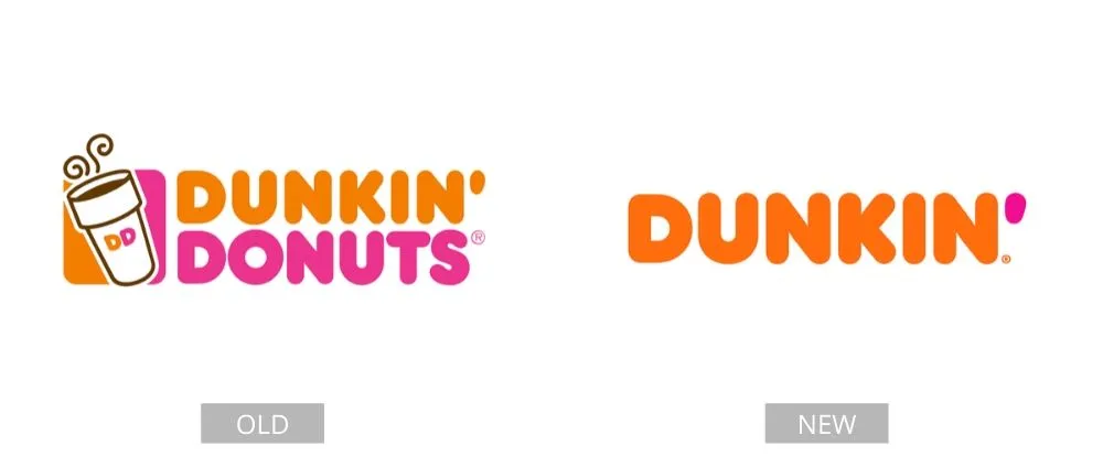
Dunkin’ Donuts has since become merely Dunkin’. The company established that it needed a rebranding to expand its offerings, despite keeping its original colors and design from the first logo. This variant was initially used in Massachusetts in 2018. The new brand name will eventually be implemented in all of the company’s international locations.
Pages: Page 1, Page 2, Page 3, Page 4, Page 5, Page 6, Page 7, Page 8, Page 9, Page 10, Page 11, Page 12, Page 13, Page 14, Page 15, Page 16, Page 17, Page 18, Page 19, Page 20, Page 21, Page 22, Page 23, Page 24, Page 25, Page 26, Page 27, Page 28, Page 29, Page 30, Page 31, Page 32, Page 33, Page 34, Page 35, Page 36, Page 37, Page 38, Page 39, Page 40