This is why the Audi logo has four rings
Regarding old businesses, rebranding is critical to keep up with current times. Audi’s logo has also evolved significantly during its decades of operation. Four interlocking rings symbolized the merging of four vehicle manufacturers in the German state of Saxony: Audi, DKW, Horch, and Wanderer became Auto Union AG.
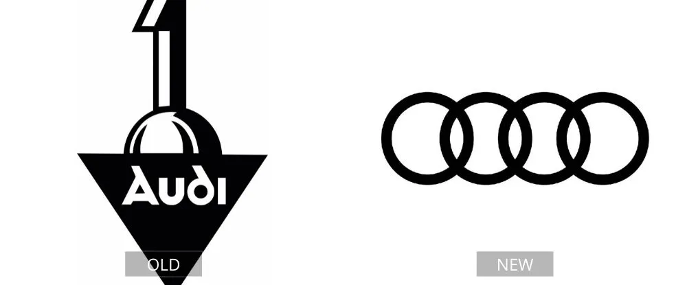
The first design, created in 1909, was relatively simple, yet it does not resemble a car logo. The new design, which consists of four rings, is far more appealing and easy to distinguish. The designers thought the logo had to look stylish both on paper and online. As a result, the four rings became two-dimensional in 2016.
Pages: Page 1, Page 2, Page 3, Page 4, Page 5, Page 6, Page 7, Page 8, Page 9, Page 10, Page 11, Page 12, Page 13, Page 14, Page 15, Page 16, Page 17, Page 18, Page 19, Page 20, Page 21, Page 22, Page 23, Page 24, Page 25, Page 26, Page 27, Page 28, Page 29, Page 30, Page 31, Page 32, Page 33, Page 34, Page 35, Page 36, Page 37, Page 38, Page 39, Page 40