GoDaddy’s new logo scales back the early web’s personality-driven days
The main element of the logo for GoDaddy was the bright green color and the boldness of the font. This clear and recognizable font and logo worked as a representation for the company for a few decades. The first GoDaddy logo included the brand’s name in a casual style.
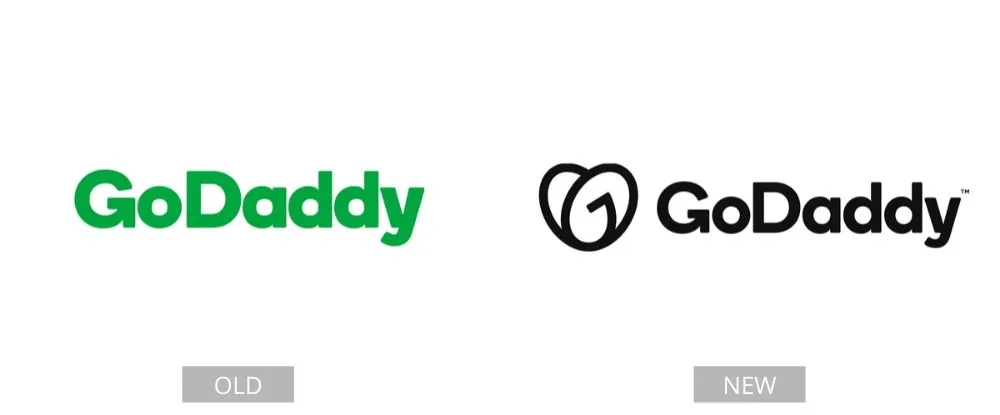
In 2018, they decided that it was time to move on and concentrate on improving the font instead. They removed the boldness of the lettering and replaced it with a clean, black typeface and a basic image. It looks much more professional now.
Pages: Page 1, Page 2, Page 3, Page 4, Page 5, Page 6, Page 7, Page 8, Page 9, Page 10, Page 11, Page 12, Page 13, Page 14, Page 15, Page 16, Page 17, Page 18, Page 19, Page 20, Page 21, Page 22, Page 23, Page 24, Page 25, Page 26, Page 27, Page 28, Page 29, Page 30, Page 31, Page 32, Page 33, Page 34, Page 35, Page 36, Page 37, Page 38, Page 39, Page 40