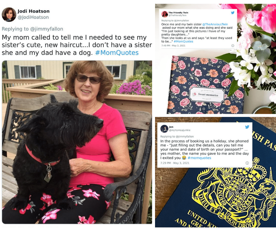
Diet Coke has returned to the dynamic ribbon
Even the most well-known brands or businesses require rebranding from time to time. To maintain a modern image for clients, companies must create new logos and content. Diet Coke announced a complete redesign of its trademark packaging on December 25, 2017.
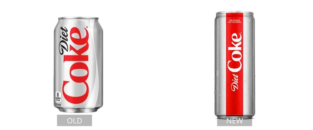
The new branding also incorporated a significantly modified version of the former logo. The “Diet” script is considerably smaller; “Diet” and “Coke” have a single color rather than two tones; the “k” and “e” in “Coke” are no longer connected, and serifs have been removed from the “k.” The finished product resembles the classic 1994 logo.
Pages: Page 1, Page 2, Page 3, Page 4, Page 5, Page 6, Page 7, Page 8, Page 9, Page 10, Page 11, Page 12, Page 13, Page 14, Page 15, Page 16, Page 17, Page 18, Page 19, Page 20, Page 21, Page 22, Page 23, Page 24, Page 25, Page 26, Page 27, Page 28, Page 29, Page 30, Page 31, Page 32, Page 33, Page 34, Page 35, Page 36, Page 37, Page 38, Page 39, Page 40